
Design Process
Role & Experience
My experience in accessibility began in education, where I was responsible for ensuring the University of Central Arkansas (UCA) Information Technology department's website complied with Section 508 from 2007 to 2015. WCAG didn't exist early on, but it emerged later, making everything easier to understand. Seventeen years later, it is evident that accessibility has had a profound impact on the private sector. It wasn't always like that. My career started in higher education. By federal law, under the Americans with Disabilities Act, Section 508, all government entities are required (federal law) to ensure that their technological resources are accessible. The law did not apply to the private sector. As the years passed, the private sector began to face lawsuits targeting websites and apps that were not accessible to individuals with disabilities. Now, companies have teams dedicated to ensuring apps are accessible.



Creativity and Accessibility Should Not Suffer
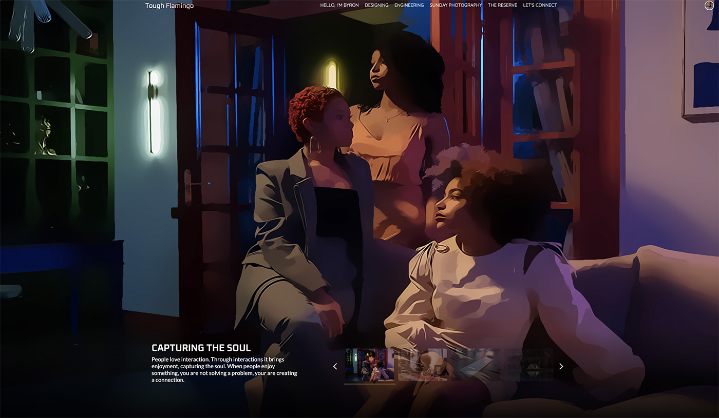
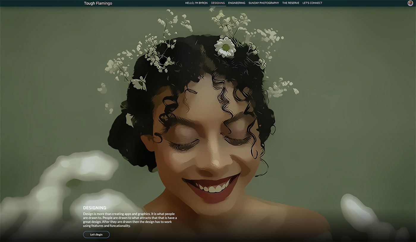
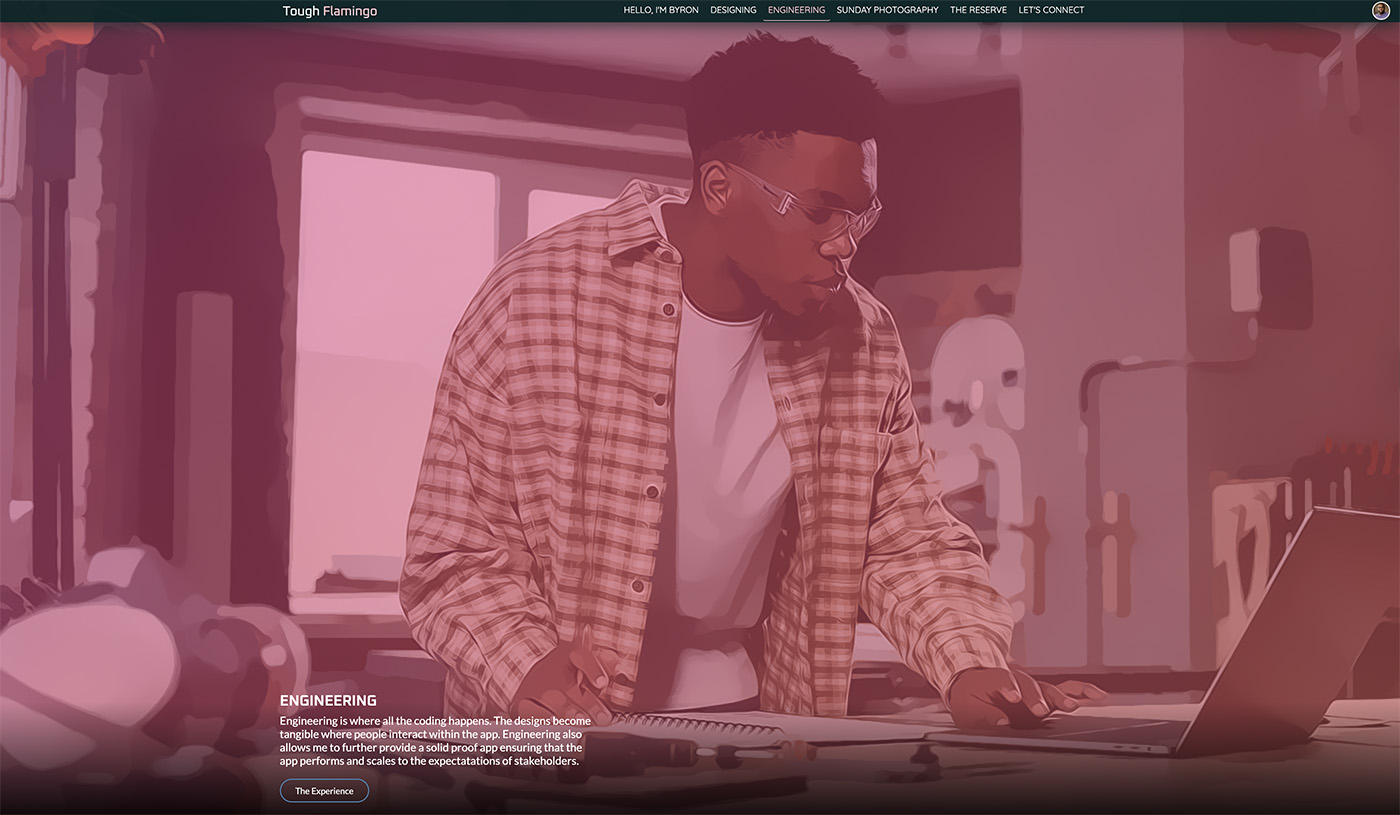
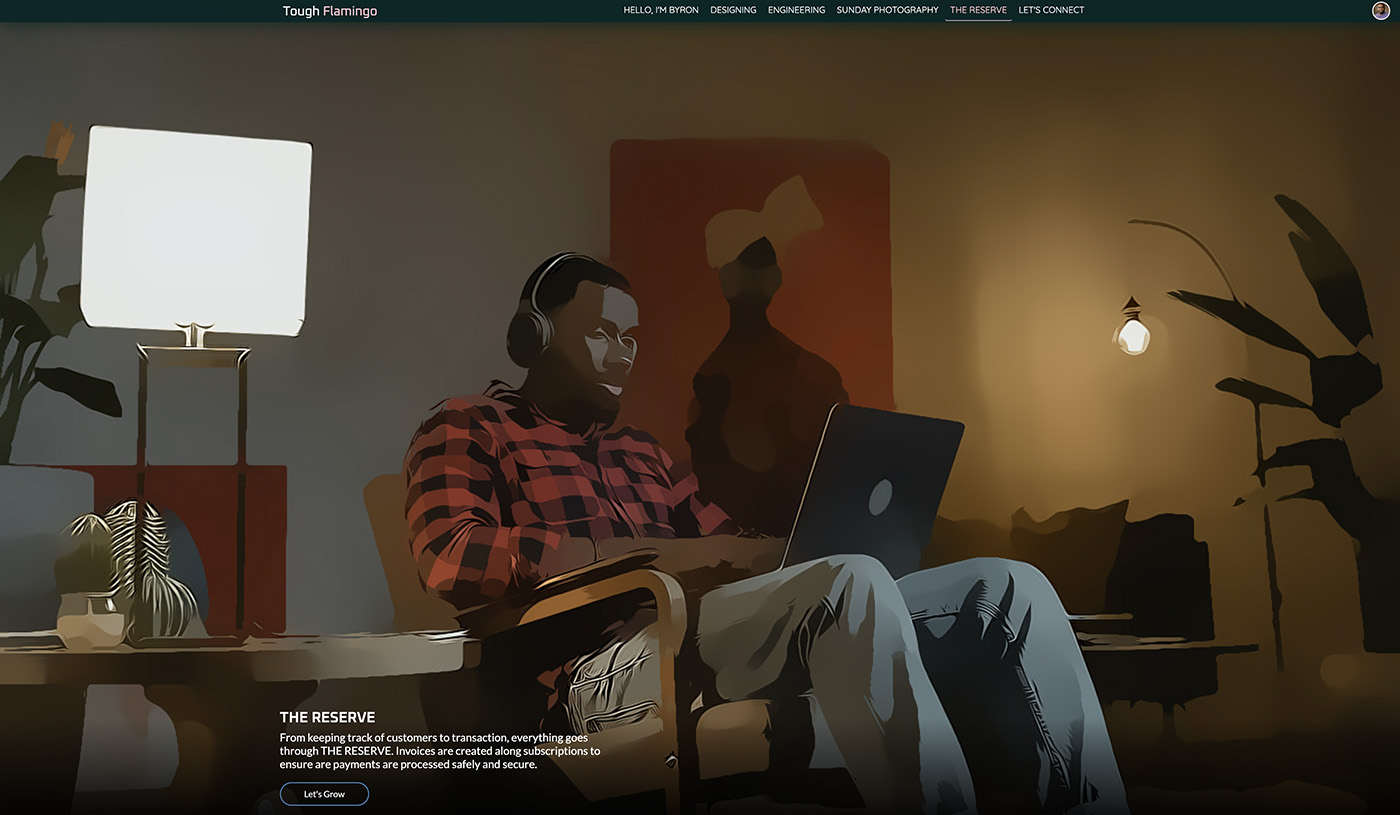
You can have a great app that is both creative and accessible. I wanted to use my website as a case study to test and share the findings I encountered. Everything was designed and developed based on the research that I conducted. The research continued throughout the process, as I encountered new challenges.
Research
During the research, I focused heavily on the homepage. The homepage is the first impression users have. It is the deciding factor for users to determine whether to continue or leave. A lot of design attention is given to the page. For data collection and testing, I used two tools: Google Lighthouse and PageSpeed Insights. I am quite sure there are many other apps I could have used, but these tools were readily available, and I had quick access to them.
Design Decision & Rationale
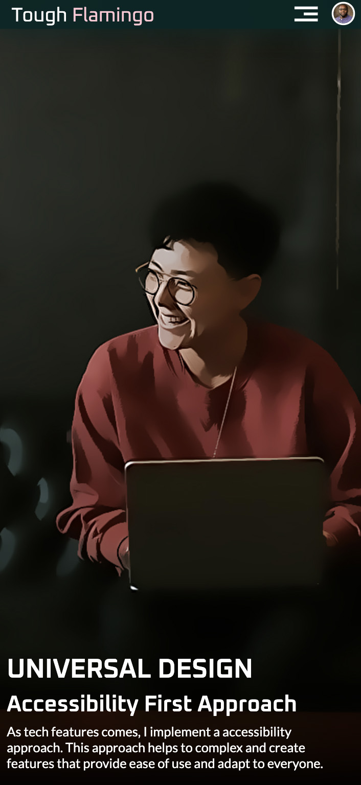
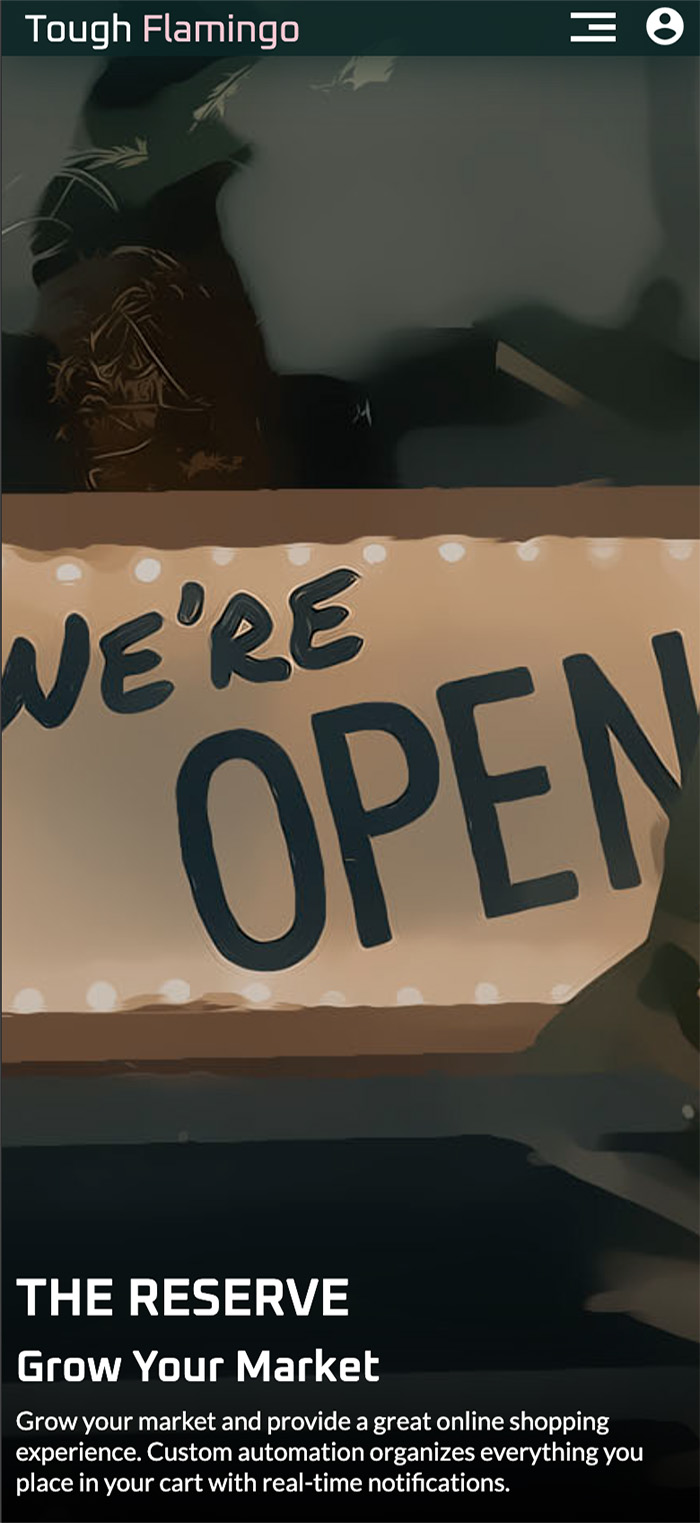
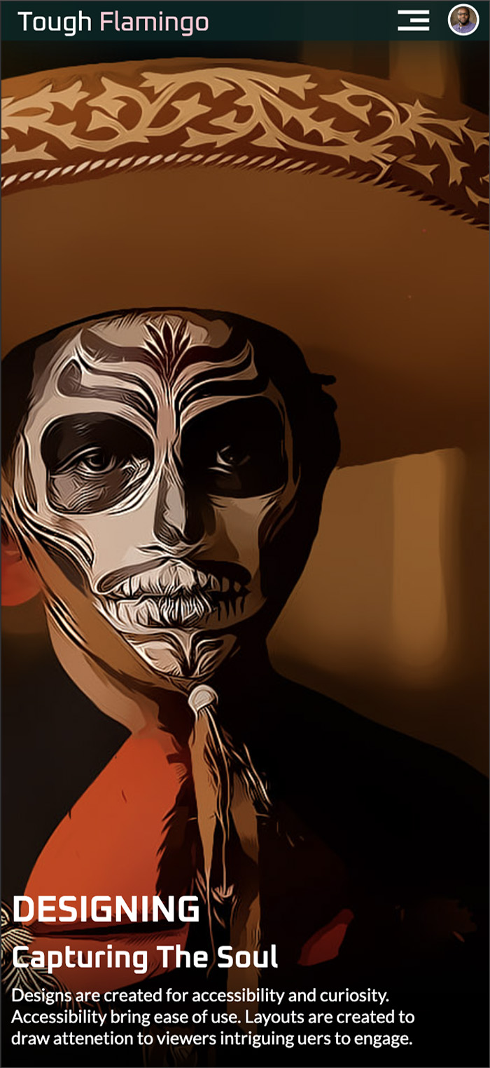
From a design perspective, I wanted to create a layout that was simple but drew users in to keep them engaged. I chose to use bold, vibrant imagery and small blocks of text. Through creativity, I was able to make a bold statement while still creating an accessible page that users can navigate without issues. I add drop shadows to images so that the text remains readable regardless of the image used, resolving any color contrast issues.
So Far So Good
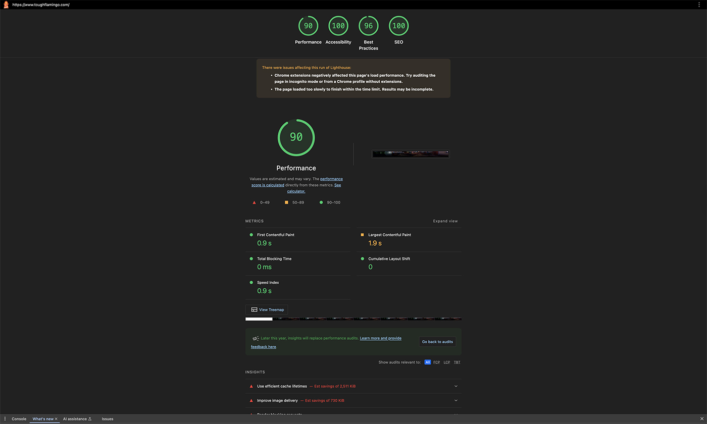
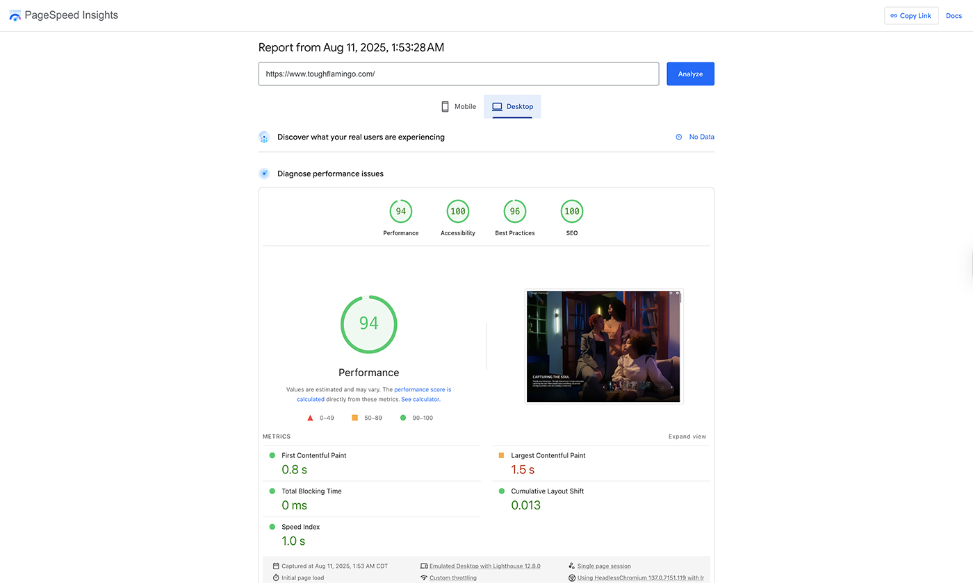
Based on the data I received, I achieved a score of 100 on both Lighthouse and PageSpeed. This is great news to see. Everything is consistent, and the flow is nice. This was a key milestone: receiving the score using two resources with the same outcome. That was only the first half of it. There were challenges I encountered that the tools would never have recognized, specifically functionalities where you have to click a button to reveal more information.
Challenges & Solutions
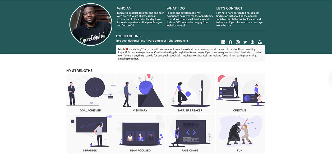
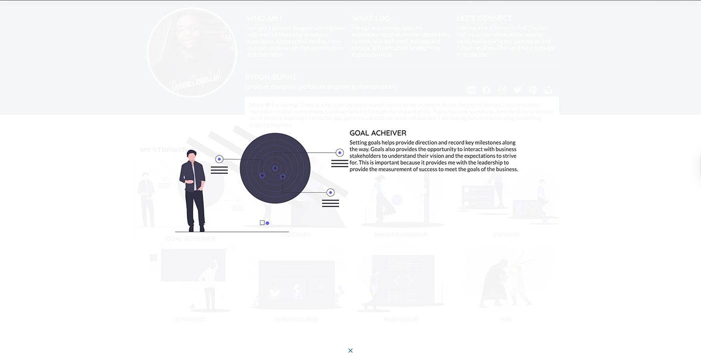
From the layout view, everything looks accessible, but I discovered through screen reader and keyboard testing that some interactions I created were not accessible. The accessibility tools would have never recognized these issues because they cannot read them. This is where screen reader and keyboard testing are performed to see whether a user can navigate the page. The problem was identified on the modals and sidebar on the page. These areas reveal more content, but it is hidden from the user until a button is pressed to unhide it.
Screen Reader and Aria Attributes
To address these areas, I used a screen reader, VoiceOver, to ensure users could access the information. The modals will be a perfect example because they require more functionality to be implemented. To solve the problem, I had to enforce aria-attributes on the tags. Aria attributes are only recognized by screen readers. They provide users with information about the element and how the interaction works. To solve the modal problem, I applied an aria-labelledby attribute to the buttons. This will eliminate an extra click that the user will have to make, and read the content in the modal associated with the id.

Results & Impact
Note: Unpin all extensions when testing to ensure you get the best results.
The extension will place pieces of code into your site, causing unwanted errors and warnings.
Based on the results I gathered and tested, accessibility testing is very tricky. That is the reason I tested with two different scoring models to ensure the test results were comparable. You never reach a complete solution because challenges will continue to arise based on the needs of users with disabilities. I also tested another accessibility checker, but it added components, shifting them into areas that will not pass the color contrast test. I removed it from my research. What amazed me was the other areas that improved as a result of the accessibility approach I implemented.
Quantitative Data
The quantitative data shows that when a page is accessible, other areas are also affected. Both tools yielded consistent scores. We see a slight difference in Performance: Lighthouse records it at 90%. PageSpeed Insights reports the page's performance at 94%. Both are not far off. Accessibility is at 100%. SEO is at 96%, and Best Practices is at 100%. The data shows that taking an accessibility approach creates a very well-structured page.
Qualitative Data
The qualitative data reveal that just because it appears accessible doesn't mean it truly is. ScreenReader and Keyboard testing must be conducted to ensure users can access information that requires interaction, such as clicking on a button. The tools will never recognize them.
Final Reflections
Accessibility is a critical aspect of designing and developing, and doing our part in ensuring everybody has a great experience, no matter the circumstances. Despite significant progress in this field, several common problems and challenges remain in web accessibility. Here are a few:
- Lack of Awareness: Many web developers and designers are not fully aware of the importance of web accessibility and the needs of people with disabilities.
- Inadequate Training: There is a shortage of professionals with expertise in web accessibility, resulting in a lack of knowledge and skills in this field.
- Inaccessible Content: Websites often feature content that is not accessible to all users, including images without alt text, videos without captions, and documents in non-accessible formats.
- Mobile Accessibility Issues Mobile websites and apps may not always meet accessibility standards, making it difficult for users with disabilities to access content on their smartphones or tablets.
- Inconsistent Standards: Lack of consistent and universally adopted accessibility standards can lead to confusion and varied levels of accessibility across different websites.
Accessibility First Approach
My approach is to adopt an accessibility-focused strategy when building your product. Make it a priority and adhere to the standards, as this will save you maintenance time in the long run. It is much easier to start in the ideation phase than to make revisions to your code 3 years later, once everything is created. I have seen it countless times, and it is very time-consuming. Start at the early stage. There will be challenges because you can only accommodate what you are aware of. Still, the accessibility approach will require you to have features in place to make updates quickly and effectively. The goal is the journey to Universal Design because accessibility helps everybody.